Accessibility – St. Thomas E-Learning And Research
Browsing Category

Accessibility

Accessibility, Student Systems of Support

Design Resources that are Accessible for All Learners

In this article, I introduce Strategy 3: Design resources that are accessible to all students, not just some students. This is from an Eight Strategies blog series about creating electronic orientation and success resources. New to this series? Also read about Strategy 1 and Strategy 2. 

Strategy 3: Design Resources Accessible for All  

Learn to design resources that are accessible to all learners, not just some learners. I do not know how to fully do all of this (yet), but I am committed to continuing to learn accessibility skills. Whether you are developing a digital orientation, tutoring support, employee training, or another resource in Canvas (or another learning management system), you want everyone to have access to your terrific content, right?  

Accessible for All: Our Values, Mission, and the Law 

Creating fair and equitable access for all is the right thing to do. My values and the St.Thomas Mission Statement guide my accessibility work. Advancing the common good is about the well-being and participation of everybody in our community. People need to have full access to information and learning experiences, including digital/online content, in order to be active members of a learning community.  

If values and mission are not enough to nudge and inspire, recall the many laws (Americans with Disabilities Act-ADA, the Rehabilitation Act Section 504 and 508, Minnesota Human Rights Act) that give “teeth” to these principles. The Section 508 Refresh and What It Means for Higher Education (LaGrow2017) describes Electronic Information and Communication Technology (EICT) as accessible “if it can be used as effectively by people with disabilities as it can by those without.”  As we communicate information electronically (digitally, online), ensure that our learners have equal opportunity and equivalent ease of use.   

Specific Strategies to Use Right Now 

Consider these actions as you strive to create student success sites that work for all learners!

  • Develop a Universal Design for Learning (UDL) Mindset. Universal Design for Learning (UDL) is a set of research-based principles to guide lesson design and teaching. This UDL at a Glance video (4:36) effectively introduces UDL. This CAST website provides additional information on UDL. Consider following the  CAST Twitter to join this movement to expand learning opportunities for all people. 
     
  • Incorporate new accessibility skills into your resource design. ThUniversity of St. Thomas Faculty Development accessibility website page describes approaches to create better access for all. The University of Minnesota Accessible U site promotes six Core Skills for targeting accessibility practices into your site design:  
    • Headings and Document Structure 
    • Hyperlinks 
    • Video Captions 
    • Bullets and Numbered Lists 
    • Color and Contrast 
    • Image Alt Text 

The next revision of the University of MN Accessible U site will add a 7th core skill to the list.   

  • Use the Canvas features for accessibility designOr if you are from an organization that uses another learning management system, ask that company for their accessibility features.  
     
  • Keep on learning! After you learn and incorporate one new accessibility practice, pick another skill to develop. Creating accessible digital resources for all learners requires continual learning and a commitment from all of us. 

Examples in our Success Sites 

Below are some of the practices we currently use in our orientation and student success sites that are co-created with the St. Thomas E-Learning and Research team (STELAR).  

  • Ensure that anything with audio is closed captioned.  
  • In addition to close captioning, also include a transcript document of the audio or video content.  
  • Use bold or italics instead of underline to emphasize a wordunderlining denotes a URL link in an online environment.  
  • Structure documents using paragraph styles or heading tags to make the documents accessible to an individual using a screen reader, and more readable for all students.  
  • When using a colored font for emphasis, use color combined with another visual indicator (bold or italics) to convey information. Someone with color blindness may not perceive the emphasis if you only use color. 

Providing an equitable and effective learning environment for all students requires that we present teaching and learning materials in ways that are accessible for all, including individuals with disabilities. When course materials are designed with this intention, ALL learners benefit. 

This post was written by Jo Montie, Online Learning Systems Facilitator with the St. Thomas E-Learning and Research (STELAR) Center at the University of St. Thomas in St. Paul, Minn. To learn more about this topic, please visit our website at www.stthomas.edu/stelar or email Jo at jkmontie@stthomas.edu. 
Accessibility, Best Practices, Tips, and Tricks

Making Your Canvas Site More Accessible

Canvas as a Hub for Accessibility

Glori Hinck and Jo Montie

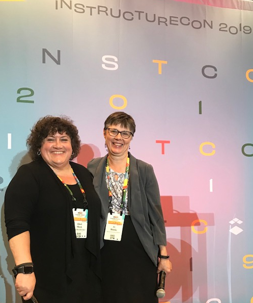
Glori Hinck and Jo Montie of STELAR recently presented at the InstructureCon 2019 (Canvas) conference on the topic of accessibility in Canvas courses.  It wasn’t that long ago that disability activists were fighting for physically accessible public spaces.  As educators, we need to advocate to make digital spaces, including our online course content, accessible to everyone.  What’s more, all students will benefit from a proactive approach to accessibility, not only those with documented disabilities.  For example, students may have an undiagnosed learning disability or English may be their second language.  Take a few moments to experience web accessibility from the perspective of a student with a vision or hearing impairment or loss of mobility.  Can you zoom your Canvas site to 200% without loss of content or functionality?  Navigate without a mouse?  Understand the content with the volume turned down?  Not sure how to get started?  Review the sites below for more information about accessibility.

Accessibility Resources

Accessible U

The University of Minnesota’s Accessible U website provides a wealth of information on how to make your course content more accessible.  They recommend starting with 6 core accessibility skills:

  1. Headings and Document Structure
  2. Hyperlinks
  3. Video Captions
  4. Bullets and Numbered Lists
  5. Color and Contrast
  6. Image Alt Text

STELAR Accessibility Course Site

STELAR has created a course site for sharing information and resources around accessibility.  Contact us via email at stelar@stthomas.edu if you would like to be added to this site.

Center for Faculty Development

You can also learn more about your role in creating an accessible, inclusive classroom at the Center for Faculty Development’s Accessibility page.

Canvas Accessibility Checker

Did you know that Canvas has an Accessibility Checker?  Simply click on the accessibility icon on the right side of the text editor for an accessibility report on a Canvas page.


This post was written by Glori Hinck, EdD, an Instructional Designer for the St. Thomas E-Learning and Research (STELAR) Center at the University of St. Thomas in St. Paul, Minn. To learn more about this topic, please visit our website at www.stthomas.edu/stelar or email us at stelar@stthomas.edu.

Accessibility, Best Practices, Tips, and Tricks

Finding Captioned Videos on YouTube

Captioned videos are helpful for all students and they help us meet ADA accessibility guidelines. Your students will appreciate videos with captions when they’re in a quiet place and forgot their headphones, watching in noisy public places, or have trouble understanding the speaker.

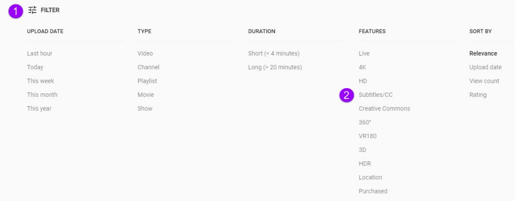
You can filter your YouTube searches so you only review captioned videos. Here’s how:

  1. Go to YouTube and type your search terms. Click the search button.
  2. When your search is completed, click the Filter button (1), then click Subtitles/CC (2).

Click Filter, then Subtitles/CC

Now your search results will only show videos that are already captioned. Please note, just because a video is captioned does not mean it is captioned accurately. You should still check to make sure the captions are well done.

And don’t forget that we have a huge amount of licensed media resources available through the library system.

This post was written by Nancy McGinley Myers, an Instructional Designer for the St. Thomas E-Learning and Research (STELAR) Center at the University of St. Thomas in St. Paul, Minn. To learn more about this topic, please visit our website at www.stthomas.edu/stelar or email us at stelar@stthomas.edu.

Accessibility, Best Practices, Tips, and Tricks

Accessibility: Why is it important, and how do I start?

What would you do if half of the internet were inaccessible to you? Can you even begin to imagine the frustration and exasperation you would feel every time you came across something you couldn’t read, couldn’t hear, couldn’t access?

Student Stephanie Garcia studies in Owens Science Hall.

That’s the reality for the 56.7 million Americans who live with disabilities. While awareness around creating accessible web pages and materials is growing, we still have a lot of work to do before the internet (and on a larger scale, our society) can be considered truly inclusive. It makes me wonder… What can I do as an Instructional Designer in the STELAR Center to be more proactive when it comes to accessibility? What can we all do? It turns out there are a variety of things each of us can do to make our materials more accessible, and it takes less time than one might think!

In an effort to be more informed about how I can make more inclusive courses and online materials through my work at the University of St. Thomas, I recently completed an online training on Designing 508 Compliant Programs and Materials.  It was a great opportunity to learn more about the many things we should keep in mind as we design courses and materials to ensure that they will be accessible to everyone. One of my biggest takeaways from this training was the importance of being proactive. It is so much easier to design with accessibility in mind from the beginning than it is to try and retroactively make a course, document, or other material accessible when it wasn’t originally designed to be so.

Now, you may think to yourself, “No one in my target audience has an accommodation need, so I don’t need to worry about it.” I’ll pose a question to you. How certain are you that absolutely no one  in your target audience has an accommodation need? There are many people with disabilities who don’t tell others about it because of the stigma and shame that surrounds disabilities. Also, even if our intended audience doesn’t include someone with an accommodation need right now, there could easily be someone with an accommodation need in the future. It would make everything much easier if we made our materials accessible from the get-go rather than trying to scramble at the last minute.

What’s more, even if someone doesn’t necessarily have an accommodation need, that doesn’t mean some members of your target audience may not prefer to use accessible materials for one reason or another. I’ll give you an example.

Here’s a trailer for the movie Frozen  that came out a few years back. (I know I know, it’s a bit off the beaten path, but I figure some of you may have heard of it!)

Now, here’s the same trailer with audio descriptions.

Personally, I really enjoyed the audio descriptions! I know I definitely chuckled at the line, “The snowman puts himself back together again and glumly contemplates his nose-less state.” I understand that some may find the audio descriptions distracting and may prefer the video without them for one reason or another, but I hope this example showed you that, even among those without  disabilities, we all have different preferences about how we like to consume information.

And that leads me to my other big takeaway from this training: Designing accessible courses and materials doesn’t only benefit those with disabilities. We all  have the potential to benefit from inclusive materials. It makes me think of the doors that use motion sensors to automatically slide open. Those doors were originally designed for people who have trouble opening a traditional door, but we all benefit from the automatic doors. Who doesn’t love walking up to a door and having it automatically open? If we can appreciate inclusivity with something as simple as doors, think of how much more we’ll appreciate inclusivity on the web!

So, what immediate steps can we all take to start creating accessible materials? Luckily, the Center for Faculty Development has curated a wonderful collection of resources where we can learn more about what we can do starting right… now!

Visit the Center for Faculty Development’s Accessibility page to learn about a variety of surprisingly simple ways to make materials more accessible.

This post was written by Karin Brown, an Instructional Designer for the St. Thomas E-Learning and Research (STELAR) Center at the University of St. Thomas in St. Paul, Minn. To learn more about this topic, please visit our website at www.stthomas.edu/stelar or email us at stelar@stthomas.edu.