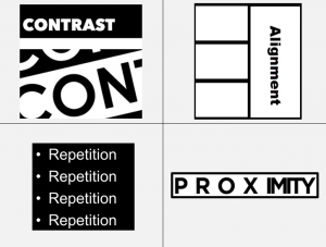
Design impacts others’ perceptions of you and your online content. Bad design can make your message hard to interpret or understand. The principles of CARP (contrast, alignment, repetition and proximity) are the foundations of good design, whether presented in hard copy or digital format.

Below are several additional recommendations to improve the design of your digital content.
- Avoid the use of underline or blue text as this signifies an active hyperlink and can frustrate a user when they try to click on it.
- Turn off proofing in Word and PowerPoint to avoid those aggravating red and green squiggles when sharing documents electronically.
- Edit hyperlinks to have meaningful names rather than using the full URL: For example, Tommie Sports instead of https://www.tommiesports.com/landing/index?_ga=2.83221782.1432532563.1528725826-25612702.1492101086.
This post was written by Glori Hinck, EdD, an Instructional Designer for the St. Thomas E-Learning and Research (STELAR) Center at the University of St. Thomas in Minneapolis, MN. To learn more about this topic, visit our website at www.stthomas.edu/stelar, or email us at stelar@stthomas.edu.