Marria Thompson – In Context - Page 4
All Posts By

Marria Thompson

Faculty

An Award for Flipper

Craig Eliason is an Associate Professor in the Department of Art History. His research focuses on the history of printing types, and particularly on the strategies and vocabularies used to classify their designs. He is currently teaching a course on the history of typography and type design. His scholarly research on type design goes hand-in-hand with his efforts as a practicing type designer.

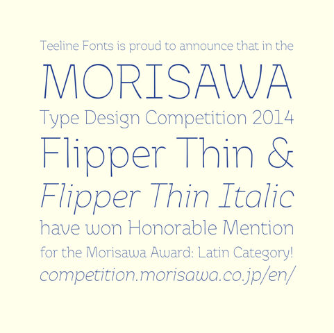
On this past Thanksgiving day, the Morisawa Corporation announced the winners of its 2014 Type Design Competition. This Osaka-based font and printing company sponsors a periodic juried competition, inviting entries of new typefaces from type designers all over the globe. There are categories for kanji fonts (used for written Japanese) and Latin fonts (our familiar abc’s). The judges were among the most eminent names in type design. The main competition, the Morisawa award, was given to type designs showing “creativity and excellence in design.”

I was pleased to learn that two fonts from a typeface family I have created, called Flipper, were awarded Honorable Mention by the judges. My work was thus one of six designs distinguished from the hundreds of entries for a prize in the Morisawa Award Latin category (and the only selected entry from a U.S. designer). A trophy is being sent from Japan, and there was even a cash prize (which sounded like a truly extravagant sum until I looked up the yen/dollar exchange rate)!

morisawa

I started designing typefaces in 2008, when I realized that my research agenda–studying the history of type design–would benefit from the immersive experience of undertaking such design myself. The design skills I have developed have, without question, sharpened my ability to assess design decisions made in historical typefaces. My skills in this specialized realm of design developed slowly, since much of the process was self-guided and remained a part-time project; but I steadily improved. My second design project was a conceptual typeface that I called “ambicase.” Each of its letters combined the traditional upper- and lowercase forms of that letter. Unlike my inaugural project, this one was good enough to release to the world, so I established a foundry, Teeline Fonts, and started selling licenses for the fonts. Ambicase Modern, and its ultra-bold brother Ambicase Fatface which came along a year later, are odd enough that their versatility (and thus their market potential) is limited, but they did earn a feature article in the typography journal Codex.

ambicase

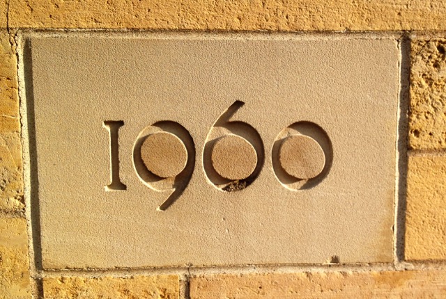
The project that won the Morisawa distinction, Flipper, started in September 2013, right here on the St. Thomas campus. Walking through the quad, my eye was caught by the cornerstone in the Murray-Herrick building. It reads “1960,” not in the pseudo-medieval inscribed letters that are so prominent on campus, but rather in strikingly modern glyphs. What most interested me was the pattern of thick and thin parts of the bowls (the rounded parts of the figures): while in most glyphs we are used to seeing the thickest parts of the bowls on the sides and the thinnest parts on the top and bottom, these figures had it the other way around–“flipped”! Could I build a whole typeface around this idea? I imported the photo of the zero into my font editor software and traced it, called it an “o,” and started building an alphabet.

cornerstone

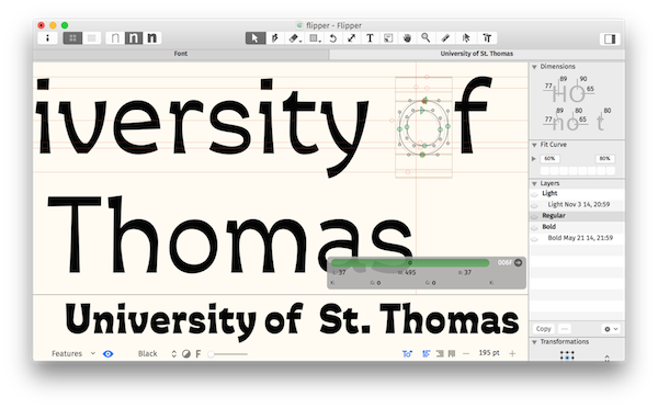
Though that “o” has been almost untouched since, I have discovered that this unconventional pattern of thicks and thins (often called “reverse contrast”) poses difficulties if it is to be massaged into a workable type. I came up with a system of occasional serifs and flared stroke endings which combined to normalize the alphabet into a readable and attractive design. Along the way I’ve solicited feedback from peers in the type world at every opportunity: by signing up for a “type-crit session” at an Amsterdam type conference, for example, or getting peer review from English type pros at a pub during my study-abroad trip to London last J-term. In the meantime, I have expanded the weight range, too. This resulted in, at one end, a super-bold font that emphasizes the cartoonish energy of the reversed contrast. At the other extreme, the thinnest weight reduces the contrast pattern to a very subtle effect, producing a friendly and airy impression. It was these thinnest weights (upright and italic) that were singled out by the Morisawa judges for the honorable mention.

flippereditor

As a professor, most of my professional engagement takes on more traditional forms: searching in archives, delivering presentations, and publishing original research. My work as a designer is nonetheless valuable as a complement to my work as an art- and design historian. I am grateful for opportunities like the Morisawa competition to validate my type designs. I will take this award as encouragement to complete Flipper and to keep including creative work as a key way for me to understand the world of type design.


Asmat, Faculty

AMAA Celebrates National Museum Day

In honor of National Museum Day on September 27, I felt it would be appropriate to highlight St. Thomas’ own museum – the American Museum of Asmat Art (AMAA).  The AMAA is dedicated to the art and culture of the Asmat people, who live on the southwest coast of the island of New Guinea, which is directly north of Australia in the southwest Pacific Ocean. With more than 2000 works, the AMAA has the largest collection of Asmat art in the country. –Dr. Eric Kjellgren, Clinical Faculty in Art History and Director, American Museum of Asmat Art

The Asmat people have long been renowned as among the finest and most prolific wood sculptors in the Pacific Islands. In addition to wood, Asmat artists work in a rich variety of other materials, including fiber, feathers, bone, and shell, drawn from the rivers on whose banks they live and the tropical rainforests that surround their villages.

AMAA Gallery

IMG_0450

Much of Asmat sculpture, like the towering ancestor poles (bis) and soul canoe (wuramon) on view in the Gallery in the Anderson Student Center, was originally created for use in religious ceremonies.  Many of these rites, in whole or in part, honored individuals in the community who had recently died and helped to send their spirits onward to safan, the land of the ancestors. Today, contemporary Asmat artists also create innovative forms of sculpture and other works for the global art market.

Man and a Dog in a Canoe, 2009

Man and Dog in a Canoe, 2009, Adam Saimas, Asmat people, Bismam region, Syuru village

Missionaries from the Crosier Fathers and Brothers, a Catholic religious Order, who worked in the Asmat region beginning in 1958, originally formed the AMAA’s collection.  The museum had two previous homes in Hastings, Nebraska and Shoreview, Minnesota.  In 2007, the Crosiers, wishing to place the collection in a setting where it would be used to educate students and the public about Asmat art and culture, gave it to the University of St. Thomas. The Gallery, located in the Anderson Student Center, opened in 2012 and presents items from the collection that are reflective of different aspects of Asmat art and culture. Today, the collection continues to grow and the AMAA forms an integral part of the university’s broader commitment to fostering respect and appreciation for cultural diversity and the artistic achievements of all of humanity and of the Department of Art History’s dedication to teaching global arts in context. The exhibitions regularly changed throughout the year, so be sure to check back often to experience new works from the AMAA collection.


The Gallery Hours

Monday-Wednesday: 10 am – 4 pm

Thursday: 10 am – 8 pm

Friday: 10 am – 2 pm

Saturday and Sunday: Noon – 4 pm


Please visit the AMAA website for more information.


Students, Undergraduate Student

MacAulay Steenson: First Ladies of Minnesota

MacAulay Steenson is a junior at St. Thomas, majoring in Art History and currently spending her fall semester studying abroad in Paris. She is also an active member of the Department of Art History, working for our Visual Resources Library.

Last Christmas, I was approached by the University of St Thomas Art History Department and the 1006 Society with a project concerning the Governor’s Residence First Ladies of Minnesota portrait collection. What I initially thought would be a simple research project quickly grew into a multifaceted exploration of the history of both the Residence and the state of Minnesota. An additional side project emerged, as I was asked to write the Governor’s Residence entry for the new SAH Archipedia website, an authoritative online encyclopedia of significant architectural structures throughout the United States.

Mac

I began the First Ladies project by deconstructing the portraits—removing them from their frames—to create digital versions of each, which will eventually be displayed online. From there, I started my initial research on the First Ladies themselves. Through an individual analysis of each lady, my research has provided a unique lens through which I could examine what was happening in Minnesota during their husbands’ time as Governor. For example, the first ten or so First Ladies moved to Minnesota from another state. Their stories are examples of the struggles that many new residents faced when creating lives in the very young state of Minnesota.

A webpage devoted to the First Ladies will be added to the Governor’s Residence’s website showcasing the research and stories I have found. I originally underestimated the role that these women played in Minnesota’s history and have learned that they were their husbands’ counterparts in every way. Their role provided them with flexibility and power that differs from the Governor’s and the way in which the first ladies exercised their position changed from woman to woman. Each woman took on the responsibilities of First Lady in their own way and I am interested to see how the role of the Governor’s spouse continues to change.

 IMAG0505