This summer I led a two-credit seminar on type design as part of St. Thomas’s Aquinas Scholars Honors Program. The underlying premise of this course was to understand type by working with it intensively. The major project was to complete an original font design, corresponding to an established historical style and suited for a particular usage related to the student’s major. Each student spent many hours with digital font-editing software, drawing and refining the whole alphabet and then some.
None of the students had previous experience with lettering nor vector-based drawing. Additionally, I know from experience that every designer’s first go at type design usually produces little to be excited about. So I was amazed that, within six weeks, these three students generated handsome, thoughtfully conceived, and well-crafted typefaces. Here they are:
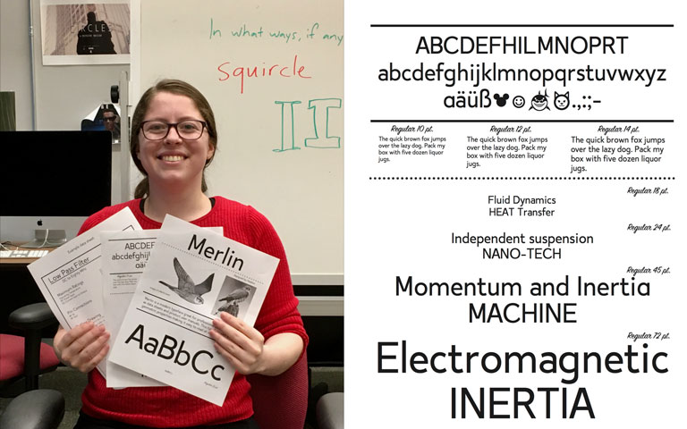
“Merlin is a modern typeface great for professional documents such as data sheets and product user manuals. This typeface uses simple geometric properties
making it easy to read at small sizes.” — Heather Krech (Electrical Engineering major)
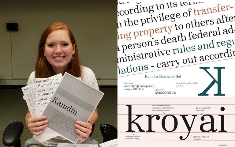
“Kamdin is a rational typeface originally conceived for legal documents and text-heavy environments. Staying within the rational style, Kamdin’s symmetrical, bracketed serifs and high contrast conveys its stringently formal tone. The construction is rational in its moderate contrast and regularity without extreme characteristics. The large counters, ball terminals, and various details—such as the leg of the “k” or tail of the “a”—give a historical touch, lending a sense of authority.” — Vic Morrison (Operations Management major)
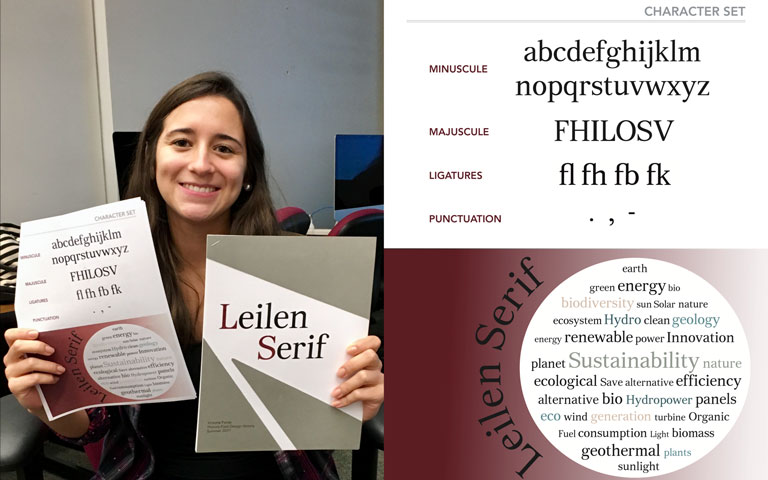 “Named after my sister’s first name, Leilen Serif was created with the purpose of being used in formal documents in the engineering fields such as product reports, instruction manuals, and evaluation forms. However, it could be applied on any text involving small type. The design was fully inspired by the typefaces that constitute the Transitional Serif category of type. These include: Adobe Caslon, Baskerville Original, Mrs Eaves, Plantin, Arnhem, Times New Roman, and Le Monde Journal. The design of Leilen Serif includes serifs with smooth edges, proportionality between individual letters, bracketed transition from the stem to the serif, and moderate contrast between thick and thin parts in order to achieve better legibility.” — Victoria Farias (Electrical Engineering major)
